Grid table
Screen item “Grid table” is an item for entering the contents in table format when running the application and displaying the contents by narrowing down using filter option.
Basic configuration
Label / [Front] Label / [Back] Label
It is used as supplementary for the name to be displayed on button or the name of input item.
When screen item is Input and Select item
The name set in label is displayed to the left of the input field.The name set in [Back] label is displayed to the right of the input field.When screen item is button
The name set in the label is displayed on the button.
Note
When nothing is set in the label of grid table, the caption at the top is set to “hide”.
Lines definition
Set the rows that can be added in the table.
Lines addable
If the check is ON, it is possible to add rows during the execution of the application.
Linage
Number of rows displayed in the table can be set when check of “Lines addable” is OFF.
Maximum linage
Maximum number of rows that can be added in the table can be set when check of “Lines addable” is ON.Set a value greater than 1 so that the number of rows entered can be added.
Number of lines displayed initially
Set the number of lines displayed first during input.When “Maximum linage” is set, set the number of lines such that they are less than the Maximum linage.“0” can also be set for number of lines displayed initially.
Definition of column
 Set the column of grid table.
Size of column
Set the width of column.Same size is set for all the columns.Resize column
When enabled, column width can be changed by dragging in the execution screen of form that contains grid table.By default, it is disabled.Settings are applied to all columns.Header location
Set the display position (text alignment) of header of column.Same display position is set for all columns.Field location
Set the detailed display position (text alignment) of column.Same display position is set for all columns.Search feature
Set ON/OFF of Search feature(filter).The displayed line can be narrowed down when Search feature is ON.Settings are applicable to all columns.Filter conditions
Set the Comparison condition when filter is set.Settings are applicable to all columns.Column number
Set the display order of column.When sorting the column, it can be dragged and swapped.Display
Set display/hide of column.The column is not displayed on screen when check is OFF and it can be used for setting/obtaining the value.The check is OFF (hide) always when type is “Hidden field”.Column name
Set the column name.Use as the logical name of the column in the application table corresponding to the grid table.Type
Set the data type of column.In case of type like Function or Select from list, where other screen items can be referred, it can be specified by using target field identification ID just as in case of “Function” and “Select from list”.Settings
On clicking Settings, it moves to “Column property” (like Input field, input validation) screen of column.Add
On clicking Add, column is added to the grid table.Delete
On clicking Delete, column is deleted from the grid table.Note
- About the display of grid table
Following operations are performed for display/hide and display type of table and column of grid table.When display type of table is “display”, display/non-display column in “Column definition” of grid table can be retained even when column definition is set to “non-display”.The display type of column is set prior to the display type of table.When display type of table is set to “non-display”, display type of column cannot be set.Data is not retained when display type of table/column is set to “non-display”.
Detail setting
Table ID
Use as physical name of application table corresponding to Detail table and grid table.Same table ID should be set for all tables when inheriting the values among tables in forms.
Table width
Specify the width of the table in pixels.
Table height
Specify the table height to be displayed in pixels.
Item name
Specify the name to identify an item within the same form.When application type is “IM-Workflow” or in case of form created in IM-BIS, it is used in the name to be displayed at the time of ‘Append setting/job property setting’.
Multiselect
Set whether multiple lines can be selected.Selection checkbox column is displayed when settings are enabled.
Column number display
Set the column number display of table in grid table.
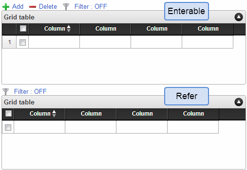
Display
Display column number for “Enterable”/”Refer”.Non-display
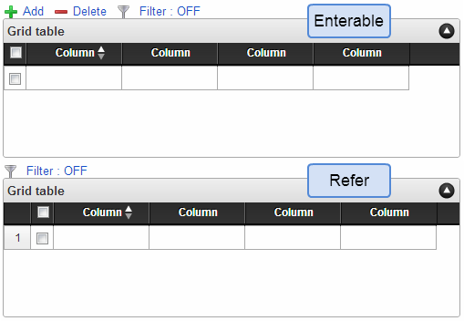
Column number is not displayed for “Enterable”/”Refer”.Display only when input is enabled
Display column number only when input is enabled.Display only in case of refer
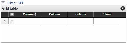
Display column number only in case of refer.
When column number display is set to “Display”
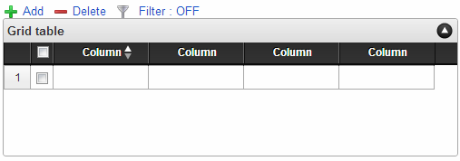
When column number display is set to “Non-display”
When column number display is set to “Display only input is enabled”
When column number display is set to “Display only in case of refer”
Pager display (reference)
When displaying in reference mode, number of pages and page feed icon is displayed in the lower part of the table.Pager is also displayed in reference mode when breakdown is 0 lines.Display all the lines of breakdown on 1 page when pager is disabled.
Display type
Screen type (Line item)
Add
Set the display type of registration screen in Web application (Standard).
Edit
Set the display type of update screen in Web application (Standard).
Refer
Set the display type of reference (details) screen in Web application (Standard).
Display/Input type (Column item)
Display/Enterable
Displays as an item that can be input.Display/Refer
Input is not possible, however, displays the settings value or entered value.Non-display
Input/Display is not possible.The settings value or entered value is not displayed. Moreover, reference from other items is also not possible.
Display type: Enterable
Display type: Refer
Item size/layout
Specify the height, width and display position of the item in the form.
Width
Specify the horizontal length (width) of the area (area surrounded by a red dotted line on designer screen) specified as an item, in pixels.
Height
Specify the vertical length (height) of the area (area surrounded by a red dotted line on designer screen) specified as an item, in pixels.
X
Specify the horizontal position from the top-left of the form of the top-left area (area surrounded by a red dotted line on designer screen) specified as an item, in pixels.
Y
Specify the vertical position from the top-left of the form of the top-left area (area surrounded by a red dotted line on designer screen) specified as an item, in pixels.
Display style
Label style /[Front] label style / [Back] label style
Specify the format of the label.
Font
Specify the types of fonts of the text.
Font size
Specify the font size in pixels.
Font color
Specify font color by selecting from color code (hexadecimals starting with #) or color picker.
Bold
Set whether the text is to be displayed in bold.Display the text in bold when check is ON.
Italic
Set whether the text is to be displayed in italic.Display the text in italic when check is ON.
Underline
Set whether underline is to be displayed for the text.Display underline for the text when check is ON.
Background color
Specify the background color by selecting from color code (hexadecimals starting with #) or color picker.
Column properties (character string)
Setting screen for moving the column settings by clicking.Set the following items when type set to the column is “Character string”.
Type
Select column type.
Basic configuration
 Set for individual columns.
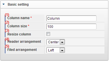
Column name
Set column name.Used as logical name of the column in the application table corresponding to grid table.Column size
Set column width.Settings are applicable only to the selected column.Column resize
When enabled, column width can be dragged and changed in the execution screen of form having grid table.By default it is disabled.Settings are applicable only to the selected column.Header location
Set the display position (text alignment) of column header.Settings are applicable only to the selected column.Field location
Set the detailed display position (text alignment) of column.Settings are applicable only to the selected column.
Input Validation
Set the input check to be used in item.
Required / [Start] Required / [End] Required
It is checked as compulsory input item when the check is ON.
Only alphanumeric
Checks whether the input contents are only single byte alphanumeric characters if the check is ON.Only a-z, A-Z, 0-9 characters can be entered and symbols are considered as an error.
Minimum letters
Checks whether the entered characters are more than the number of characters specified in item.It is not checked if there is no input in the item.Space is treated as an input item.Set a value less than or equal to the maximum letters.
Maximum letters
Set it such that characters are entered only upto the number of characters specified in the item.Space is treated as an input item.Set a value more than or equal to the minimum letters.
Custom input check
It is possible to customize and set the type of input characters and input check function.
Check format
Set the pattern of string that can be entered in regular expression.If a string that does not match with the set pattern is entered, the message set in “Error message” is displayed.
Error message
Registers the error message to be displayed when the pattern set in check format is not matched.
Input field
Field ID/ [Start] Field ID / [End] Field ID
It is used as the physical name (column name) of item in the application table.Set in such a way that field ID of all the items should be unique within the same application.
Field ID name / [Start] Field ID name / [End] Field ID name
It is used as the logical name of an item in application table.In addition, it is also used as the item name (Logical name) corresponding to the items in the list display screen.
Add to DB
Sets whether to register the value entered in the item in the database.If check is OFF, it is not registered in database.When workflow function is used, set the check to OFF since the correct value may not be displayed.
Initial value / Default selected option / [Start] Initial value / [End] Initial value
Set the value to be displayed initially in the input field.Set whether to display “Current date” as the initial value in case of items dealing with date.In case of selection type items such as select box etc., sets the value (Transmission value) to be selected in initial display.In case of “Select user”, sets whether to display “User name of Login user” in initial value.
Search settings
Set the search filter in column unit when search function is enabled.
Search target
Set whether display can be narrowed down by filtering the search function.
Filter conditions
Set the comparison conditions when narrowed down by search.
Display type (column)
When “Set display type by column unit” check is ON, display type is set for the column.When display type of column is set, it gets the priority over the display type of table.When the table display type is set to “Enterable” or “Non-display”, column display type cannot be set.
Screen type (Line item)
Add
Set the display type of registration screen in Web application (Standard).
Edit
Set the display type of update screen in Web application (Standard).
Refer
Set the display type of reference (details) screen in Web application (Standard).
Display/Input type (Column item)
Display/Enterable
Displays as an item that can be input.Display/Refer
Input is not possible, however, displays the settings value or entered value.Non-display
Input/Display is not possible.The settings value or entered value is not displayed. Moreover, reference from other items is also not possible.
Column properties (Number)
Setting screen for moving the column settings by clicking.Set the following items when type set to the column is “Number”.
Type
Select column type.
Display format (3 digits comma)
Displays the entered numerical value separated with a comma after every 3 digits if the check is ON.
Basic configuration
Set for individual columns.
Column name
Set column name.Used as logical name of the column in the application table corresponding to grid table.Column size
Set column width.Settings are applicable only to the selected column.Column resize
When enabled, column width can be dragged and changed in the execution screen of form having grid table.By default it is disabled.Settings are applicable only to the selected column.Header location
Set the display position (text alignment) of column header.Settings are applicable only to the selected column.Field location
Set the detailed display position (text alignment) of column.Settings are applicable only to the selected column.
Input Validation
Set the input check to be used in item.
Required / [Start] Required / [End] Required
It is checked as compulsory input item when the check is ON.
Minimum value
Checks whether the entered/calculated value is greater than the specified value.It is not checked if the value is not entered in the item.If “Minus allowed” check is ON, a negative number (value less than 0) can be set.Set a value less than or equal to the maximum input value.
Maximum value
Checks whether the entered/calculated value is smaller than the specified value.If “Minus allowed” check is ON, a negative number (value less than 0) can be set.Set a value more than or equal to the minimum input value.
Minus allowed (numerical value)
Sets whether a minus value (less than 0) can be input for the value to be entered or calculated.It is handled as an error when a minus value (less than 0) is entered if the check is OFF.
Decimal allowed (Numerical value)
Sets whether a decimal value can be set in the entered/calculated value.It is handled as an error if a decimal value is entered when the check is OFF.
Max decimal places (numerical value)
Set the number of digits after decimal point for the entered/calculated value.(This settings item is displayed only when “Decimal allowed ” check is ON)The number of digits should be set so as to match with the number of digits after decimal point of the line corresponding to table setting.
Input field
Field ID/ [Start] Field ID / [End] Field ID
It is used as the physical name (column name) of item in the application table.Set in such a way that field ID of all the items should be unique within the same application.
Field ID name / [Start] Field ID name / [End] Field ID name
It is used as the logical name of an item in application table.In addition, it is also used as the item name (Logical name) corresponding to the items in the list display screen.
Add to DB
Sets whether to register the value entered in the item in the database.If check is OFF, it is not registered in database.When workflow function is used, set the check to OFF since the correct value may not be displayed.
Initial value / Default selected option / [Start] Initial value / [End] Initial value
Set the value to be displayed initially in the input field.Set whether to display “Current date” as the initial value in case of items dealing with date.In case of selection type items such as select box etc., sets the value (Transmission value) to be selected in initial display.In case of “Select user”, sets whether to display “User name of Login user” in initial value.
Search settings
Set the search filter in column unit when search function is enabled.
Search target
Set whether display can be narrowed down by filtering the search function.
Filter conditions
Set the comparison conditions when narrowed down by search.
Display type (column)
When “Set display type by column unit” check is ON, display type is set for the column.When display type of column is set, it gets the priority over the display type of table.When the table display type is set to “Enterable” or “Non-display”, column display type cannot be set.
Screen type (Line item)
Add
Set the display type of registration screen in Web application (Standard).
Edit
Set the display type of update screen in Web application (Standard).
Refer
Set the display type of reference (details) screen in Web application (Standard).
Display/Input type (Column item)
Display/Enterable
Displays as an item that can be input.Display/Refer
Input is not possible, however, displays the settings value or entered value.Non-display
Input/Display is not possible.The settings value or entered value is not displayed. Moreover, reference from other items is also not possible.
Column properties (Date)
Setting screen for moving the column settings by clicking.Set the following items when type set to the column is “Date”.
Type
Select column type.
Display format (Date)
Select the display format of date of input field at the time of view.If it is not specified, date is displayed in “Date (Standard display)” format set in “Display format of Date and Time”.
Field enterable
The value entered manually can be registered if the check is ON.
Input clear button
Clear button is set if the check is ON.The input value is cleared if clear button is clicked while executing the application.
Basic configuration
Set for individual columns.
Column name
Set column name.Used as logical name of the column in the application table corresponding to grid table.Column size
Set column width.Settings are applicable only to the selected column.Column resize
When enabled, column width can be dragged and changed in the execution screen of form having grid table.By default it is disabled.Settings are applicable only to the selected column.Header location
Set the display position (text alignment) of column header.Settings are applicable only to the selected column.Field location
Set the detailed display position (text alignment) of column.Settings are applicable only to the selected column.
Input Validation
Set the input check to be used in item.
Required / [Start] Required / [End] Required
It is checked as compulsory input item when the check is ON.
Input field
Field ID/ [Start] Field ID / [End] Field ID
It is used as the physical name (column name) of item in the application table.Set in such a way that field ID of all the items should be unique within the same application.
Field ID name / [Start] Field ID name / [End] Field ID name
It is used as the logical name of an item in application table.In addition, it is also used as the item name (Logical name) corresponding to the items in the list display screen.
Add to DB
Sets whether to register the value entered in the item in the database.If check is OFF, it is not registered in database.When workflow function is used, set the check to OFF since the correct value may not be displayed.
Initial value / Default selected option / [Start] Initial value / [End] Initial value
Set the value to be displayed initially in the input field.Set whether to display “Current date” as the initial value in case of items dealing with date.In case of selection type items such as select box etc., sets the value (Transmission value) to be selected in initial display.In case of “Select user”, sets whether to display “User name of Login user” in initial value.
Search settings
Set the search filter in column unit when search function is enabled.
Search target
Set whether display can be narrowed down by filtering the search function.
Filter conditions
Set the comparison conditions when narrowed down by search.
Display type (column)
When “Set display type by column unit” check is ON, display type is set for the column.When display type of column is set, it gets the priority over the display type of table.When the table display type is set to “Enterable” or “Non-display”, column display type cannot be set.
Screen type (Line item)
Add
Set the display type of registration screen in Web application (Standard).
Edit
Set the display type of update screen in Web application (Standard).
Refer
Set the display type of reference (details) screen in Web application (Standard).
Display/Input type (Column item)
Display/Enterable
Displays as an item that can be input.Display/Refer
Input is not possible, however, displays the settings value or entered value.Non-display
Input/Display is not possible.The settings value or entered value is not displayed. Moreover, reference from other items is also not possible.
Column properties (Select from list)
Setting screen for moving the column settings by clicking.When the type set to the column is “Select from list”, perform settings related to datasource from the datasource settings link,and settings related to Display/input field from the Input field settings link.
Type
Select column type.
Item select screen
Set the layout of item list that can be selected when Search icon is clicked.
Screen title
Enter the title of the screen displayed as separate screen.Max display rows
Set maximum lines that can be displayed on list screen.Multiselect
Multiple lines can be selected on list screen when check is ON.Note that only the first item is reflected in select from list item field even when multiple lines are selected.Display
Set whether to display or not in the list screen.Display on list screen when check is ON.Column name
Set the column name to be displayed on list screen.Column ID
ID for identifying the columns displayed on list screen uniformly.Displayed in the format of “{Column name} | {Column ID}” in data mapper.Type
Set the data type of column.
Obtained value setting
Perform mapping of the destination where the value obtained in external linkage should be reflected.
Mapping information
After the data mapper is displayed by clicking on Magnifying glass icon, set the mapping for items to be mapped in data mapper.Note
For methods of setting links for using data source, refer to “IM-BIS for Accel Platform Business manager guide”.
Data type / Data type of evaluation result of expression
Specify the data type of the value to be stored in an item, or the value of evaluation result of function and the value to be stored in Hidden field.The value is not stored correctly if correct data type is not selected depending on the function that is used.
String
- The target data is handled as character data such as alphabetical characters, numeric values, kanji/hiragana etc.
Numeric value
- The target data is handled as numerical data such as decimal or integer, negative value etc.
Date
- The target value is handled as date data.
- Time or information of time zone is not stored.
Timestamp
- The target value is handled as the date data which stores time and time zone information.
Field enterable
The value entered manually can be registered if the check is ON.
Input clear button
Clear button is set if the check is ON.The input value is cleared if clear button is clicked while executing the application.
Basic configuration
Set for individual columns.
Column name
Set column name.Used as logical name of the column in the application table corresponding to grid table.Column size
Set column width.Settings are applicable only to the selected column.Column resize
When enabled, column width can be dragged and changed in the execution screen of form having grid table.By default it is disabled.Settings are applicable only to the selected column.Header location
Set the display position (text alignment) of column header.Settings are applicable only to the selected column.Field location
Set the detailed display position (text alignment) of column.Settings are applicable only to the selected column.
Input Validation
Set the input check to be used in item.
Required / [Start] Required / [End] Required
It is checked as compulsory input item when the check is ON.
Only alphanumeric
Checks whether the input contents are only single byte alphanumeric characters if the check is ON.Only a-z, A-Z, 0-9 characters can be entered and symbols are considered as an error.
Minimum letters
Checks whether the entered characters are more than the number of characters specified in item.It is not checked if there is no input in the item.Space is treated as an input item.Set a value less than or equal to the maximum letters.
Maximum letters
Set it such that characters are entered only upto the number of characters specified in the item.Space is treated as an input item.Set a value more than or equal to the minimum letters.
Custom input check
It is possible to customize and set the type of input characters and input check function.
Check format
Set the pattern of string that can be entered in regular expression.If a string that does not match with the set pattern is entered, the message set in “Error message” is displayed.
Error message
Registers the error message to be displayed when the pattern set in check format is not matched.
Input field
Field ID/ [Start] Field ID / [End] Field ID
It is used as the physical name (column name) of item in the application table.Set in such a way that field ID of all the items should be unique within the same application.
Field ID name / [Start] Field ID name / [End] Field ID name
It is used as the logical name of an item in application table.In addition, it is also used as the item name (Logical name) corresponding to the items in the list display screen.
Add to DB
Sets whether to register the value entered in the item in the database.If check is OFF, it is not registered in database.When workflow function is used, set the check to OFF since the correct value may not be displayed.
Initial value / Default selected option / [Start] Initial value / [End] Initial value
Set the value to be displayed initially in the input field.Set whether to display “Current date” as the initial value in case of items dealing with date.In case of selection type items such as select box etc., sets the value (Transmission value) to be selected in initial display.In case of “Select user”, sets whether to display “User name of Login user” in initial value.
Search settings
Set the search filter in column unit when search function is enabled.
Search target
Set whether display can be narrowed down by filtering the search function.
Filter conditions
Set the comparison conditions when narrowed down by search.
Display type (column)
When “Set display type by column unit” check is ON, display type is set for the column.When display type of column is set, it gets the priority over the display type of table.When the table display type is set to “Enterable” or “Non-display”, column display type cannot be set.
Screen type (Line item)
Add
Set the display type of registration screen in Web application (Standard).
Edit
Set the display type of update screen in Web application (Standard).
Refer
Set the display type of reference (details) screen in Web application (Standard).
Display/Input type (Column item)
Display/Enterable
Displays as an item that can be input.Display/Refer
Input is not possible, however, displays the settings value or entered value.Non-display
Input/Display is not possible.The settings value or entered value is not displayed. Moreover, reference from other items is also not possible.
Column properties (Select box)
Setting screen for moving the column settings by clicking.When the type set to column is “Select box”, perform settings related to select data from Select data link,and settings related to Display/input field from Input field settings link.When obtaining the data to be set from datasource definition, set in External linkage settings screen.
Type
Select column type.
Definition of items
Set the value that can be selected in items.The values that can be selected can be added or deleted using the + and - signs on right side of the column.
Display value
Set the value to be displayed on the screen.Sent value
Set the value registered in database as the value selected in item.When multiple items can be selected, save in database by delimiting with comma. Comma ”,” cannot be used in item value.
Empty at the top
When check is ON, a blank line is displayed in the first item of the input field.
Basic configuration
Set for individual columns.
Column name
Set column name.Used as logical name of the column in the application table corresponding to grid table.Column size
Set column width.Settings are applicable only to the selected column.Column resize
When enabled, column width can be dragged and changed in the execution screen of form having grid table.By default it is disabled.Settings are applicable only to the selected column.Header location
Set the display position (text alignment) of column header.Settings are applicable only to the selected column.Field location
Set the detailed display position (text alignment) of column.Settings are applicable only to the selected column.
Input Validation
Set the input check to be used in item.
Required / [Start] Required / [End] Required
It is checked as compulsory input item when the check is ON.
Input field
Field ID/ [Start] Field ID / [End] Field ID
It is used as the physical name (column name) of item in the application table.Set in such a way that field ID of all the items should be unique within the same application.
Field ID name / [Start] Field ID name / [End] Field ID name
It is used as the logical name of an item in application table.In addition, it is also used as the item name (Logical name) corresponding to the items in the list display screen.
Add to DB
Sets whether to register the value entered in the item in the database.If check is OFF, it is not registered in database.When workflow function is used, set the check to OFF since the correct value may not be displayed.
Initial value / Default selected option / [Start] Initial value / [End] Initial value
Set the value to be displayed initially in the input field.Set whether to display “Current date” as the initial value in case of items dealing with date.In case of selection type items such as select box etc., sets the value (Transmission value) to be selected in initial display.In case of “Select user”, sets whether to display “User name of Login user” in initial value.
Search settings
Set the search filter in column unit when search function is enabled.
Search target
Set whether display can be narrowed down by filtering the search function.
Filter conditions
Set the comparison conditions when narrowed down by search.
Display type (column)
When “Set display type by column unit” check is ON, display type is set for the column.When display type of column is set, it gets the priority over the display type of table.When the table display type is set to “Enterable” or “Non-display”, column display type cannot be set.
Screen type (Line item)
Add
Set the display type of registration screen in Web application (Standard).
Edit
Set the display type of update screen in Web application (Standard).
Refer
Set the display type of reference (details) screen in Web application (Standard).
Display/Input type (Column item)
Display/Enterable
Displays as an item that can be input.Display/Refer
Input is not possible, however, displays the settings value or entered value.Non-display
Input/Display is not possible.The settings value or entered value is not displayed. Moreover, reference from other items is also not possible.
Column properties (Image)
Setting screen for moving the column settings by clicking.Set the following items when the type set to column is “Image”.
Type
Select column type.
Select image
Specify the image file to be displayed at the set location.The image files which can be specified is limited to the image file uploaded previously by “Upload image” on the designer screen.
Link
Set the link to the next page in image.Set the method for sending when URL is set.
URL
Set the address of the site to be displayed when the picture displayed in the image is clicked.The site of link destination is displayed in a separate screen.
Sending method setting
Select “GET” or “POST” for the data transmission method.
Parameter settings
Set the combination of key and value of the parameter to be added in the value (address) set in URL.Addition and deletion is possible using “+” and “-”.
Parameter key
Select the target parameter key that edits the value set in parameter.
Basic configuration
Set for individual columns.
Column name
Set column name.Used as logical name of the column in the application table corresponding to grid table.Column size
Set column width.Settings are applicable only to the selected column.Column resize
When enabled, column width can be dragged and changed in the execution screen of form having grid table.By default it is disabled.Settings are applicable only to the selected column.Header location
Set the display position (text alignment) of column header.Settings are applicable only to the selected column.Field location
Set the detailed display position (text alignment) of column.Settings are applicable only to the selected column.
Input field
Field ID/ [Start] Field ID / [End] Field ID
It is used as the physical name (column name) of item in the application table.Set in such a way that field ID of all the items should be unique within the same application.
Field ID name / [Start] Field ID name / [End] Field ID name
It is used as the logical name of an item in application table.In addition, it is also used as the item name (Logical name) corresponding to the items in the list display screen.
Display type (column)
When “Set display type by column unit” check is ON, display type is set for the column.When display type of column is set, it gets the priority over the display type of table.When the table display type is set to “Enterable” or “Non-display”, column display type cannot be set.
Screen type (Line item)
Add
Set the display type of registration screen in Web application (Standard).
Edit
Set the display type of update screen in Web application (Standard).
Refer
Set the display type of reference (details) screen in Web application (Standard).
Display/input type(Column item)
Display
Displays an item.Non-display
The items are not displayed. Reference from other items is also not possible.