Input Form Policy
Topics
- Input Form Overall
- Input Form Parts List
- Text Box (imuiTextbox)and Password (imuiPassword)
- Text Area (imuiTextArea)
- Check Box (imuiCheckbox) and Radio Button (imuiRadio)
- Select Box (imuiSelect)
- placeholder Display Policy
- tabindex
- Character Align (align)
- Form Operation when Enter Key is pressed
- Notation for Mandatory Input
Input Form Overall
Following is recommended as a basic policy.
- Please enclose registration/update/reference screen/list screen:overall by any of the followings.
imui-form-container Screen 75% imui-form-container-narrow Screen 60% imui-form-container-wide Screen 90%
- Please refer to Table for class of table to be specified.
Input Form Parts List
Name imart tag HTML tag to be generated placeholder attribute [1] Text box imui:textbox <input type=”text” /> o Password imui:password <input type=”password” /> o Text area imui:textArea <textarea></textarea> o Check box imui:checkbox <input type=”checkbox” />
Radio button imui:radio <input type=”radio” />
Select box imui:select <select></select>
- [2]
- [1] Please refer to placeholder Display Policy for placeholder policy.
- [2] Please describe input hint in TAIGENDOME (ending a sentence with a noun) at the first line in the list. (example:Select the locale)
Text Box (imuiTextbox)and Password (imuiPassword)
In case of non-enterable (1)
readonly attribute is specified.
- E.g. : Input from floating calendar to text box (it cannot be edited directly)
In case of non-enterable (2)
readonly attribute is specified and then class=”imui-text-readonly” is specified.
- E.g. : Items that could be input on registration screen are displayed on reference screen and edit screen.
In case of non-enterable (3)
disabled attribute is specified.
- E.g. : Input control is performed depending on the selected value of radio button.
Note
Above [non-entarable] is the way to use input type=”text”, input type=”password” as it is.Other than this, a way to make it non-enterable by combining label tag and input type=”hidden” also can be applied.You can use either ways but it should be unified by screen units.
Text Area (imuiTextArea)
In case of non-enterable
It is complied with text box.(class=”imui-text-readonly” has no line and no background)
Check Box (imuiCheckbox) and Radio Button (imuiRadio)
In case of non-selectable
It is complied with text box.
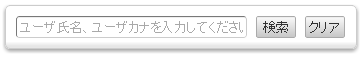
Select Box (imuiSelect)
placeholder Display Policy
Policies about placeholder of text box or text area are described.
- Screen
Hint when input item has no label or screen configuration does not allow any label
- Input OK:[Please enter user code and user name.]
Hint when input value cannot be guessed by just looking at input item label
- For sentences, honorific expression (desu/masu) is recommended.
- Input OK: [This is a name to be displayed on the screen.] [Multiple words can be specified by space delimiter]
when input format is indicated to users
- Input OK:[000-0000] [0000000(without hyphen)][2000/10/10] [YYYY/MM/DD (example:[2012/05/04])]
- Input NG:[YYYY-mm-dd] [(Please avoid technical terms on the screen that is used by end user)]
*Use adverb instead of verb in Japanese.
tabindex
- Basically, tabindex does not need to be specified.(since the move by tab key flows from upper left to lower right)
- However, please specify tabindex if you want to specify focus movement sequence depending on screen configuration.
- Please specify tabindex=”-1” for the parts where you do not want to focus by key movement.
Character Align (align)
Type Character align Numeric value Right align Character string Left align Date/Time Left align Classification/Code Left align
Character align class Left align Unnecessary Center align align-C Right align align-R
Form Operation when Enter Key is pressed
form Submit Method
There are several methods to do form submit, but the following method is used for submit in this guide line.
- Place input type=”button”, and
- execute form.submit() at click event
- Execute imuiAjaxSend
- Execute imuiAjaxSubmit
Please do not use input type=”submit”. The reason is described below.
- It is submitted by pressing enter key
- Even if you try to call imuiConfirm, submit will be executed beforehand and a confirmation dialog will not be displayed.
If input type=”submit” is used,
<form onsubmit="return false;">
  ...
</form>
return false; should be described by onsubmit attribute as above.
Submission when Enter Key is pressed
If you want to submit when enter key is pressed on search screen, please use input type=”submit”. However, please note that the confirmation dialog will not be displayed even if you call imuiConfirm, as described above.
<form ...>
  <input type="submit"/>
</form>
Notation for Mandatory Input
JSP is described as below.
- JSP
<label class="imui-required"> title </label>If above is described, [Title*] will be displayed on the screen.
- CSS (Followings are already set as common style)
.imui-required: after {
  color: #e00;
  content: " *";
}