JSP / CSS Coding Tips
Topics
This section describes JSP/CSS coding.
Need to Align Block Elements and div horizontally
Action
Please specify clearfix class for parent element, and class for float for child element.
<%@ page language="java" contentType="text/html; charset=UTF-8" pageEncoding="UTF-8" %>
<%@ taglib prefix="imui" uri="http://www.intra-mart.co.jp/taglib/imui" %>

<div class="imui-box-operation cf (1)">
  <div class="float-L (2) pl-10 (3)">
    <imui:textbox />
    <imui:button value="Search" />
    <imui:button value="Clear" />
  </div>
</div>
Screen image
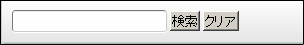
| (1)cf | clearfix class | Block element is displayed without curruption in each browser |
| (2)float-L | class for float | float:left is put. float-R class is specified when it is placed at right |
| (3)pl-10 | assist class | padding-left:10px is put. |
For JSP coding, once float: left is put to the first child element, it is inherited until it is cleared, but it should be put to each child element at screen development. (pl-10 cannot be correctly obtained. div will be made to 100%)
Display Character Link in Blue/Black Character
Specification
- Followings will be written in blue character (when the mouse is placed on it, it will turn to light blue + under score).
a tag class without specification
- Following table
- imui-table-box
- imui-table table
- imui-table-calendar
- imui-table-sort
- imui-table-mixed
- imui-table-inner
- imui-form
- imui-form-search-condition
- td in the following table
- imui-table-sort
Action
- If you want to change character link written in black to blue daringly, please specify <a class=”imui-accent”>.
- If you want to change character link written in blue to black daringly, please specify <a class=”imui-unaccented”>.
Reference:Process Icon/Process Link
Placing Title Bar/Tool Bar on UI Component or CSS Box Item
Placing Title Bar/Tool Bar on Operation Box
Action
JSP
<%@ page language="java" contentType="text/html; charset=UTF-8" pageEncoding="UTF-8" %>
<%@ taglib prefix="imui" uri="http://www.intra-mart.co.jp/taglib/imui" %>

<div class="imui-box-toolbox (1) mt-20">
  <div class="imui-box-title (2) imui-box-toolbox-look (3)">
    <h3>This is H3</h3>
  </div>
  <div class="imui-toolbar-wrap">
    <div class="imui-box-toolbar-inner">
      <ul class="imui-list-box-toolbar">
        (omitted)
      </ul>
    </div>
  </div>
  <div class="imui-box-toolbox-content">
    <!-- Simple Search -->
    <imui:textbox class="wd-225px" placeholder="Please enter user name and user KANA" autofocus="true" />
    <imui:button value="Search" class="imui-button" />
    <imui:button value="Clear" class="imui-button" />
  </div>
</div>
- Screen Image

*Added style
Tool box (same frame border with imui-box-operation)
imui-box-toolbox
Title bar (h2 and h3 look the same. Use imui-box-title.h3 when imui-chapter-title.h2 is used)
imui-box-title, imui-box-title.h2, imui-box-title.h3
Title bar/Tool bar upper part rounded effect (should be fitted to (1))
imui-box-toolbox-look
Contents
imui-box-toolbox-content
Tool bar
imui-toolbar-wrap, imui-box-toolbar-inner, imui-list-box-toolbar
Theme Color border
Please use following CSS when theme color and border color are specified.
| border color specification | imui-theme-border-color |
Implementation Example
Drawing 100px Solid Line for left-border
(1)CSS (width and style must be included)
.new_class {
  border-left-width: 100px;
  border-left-style: solid;

  ...
}

Reference Information
/* border of theme color */
.theme-border-color(@top-color: desaturate(@theme-color, 10%), @right-color:desaturate(@theme-color, 10%), @bottom-color: desaturate(@theme-color, 10%), @left-color:desaturate(@theme-color, 10%)) {
  border-top-color: @top-color;
  border-right-color: @right-color;
  border-bottom-color: @bottom-color;
  border-left-color: @left-color;
}
Adding Descriptions to Screens
- class and icon in a description
- Description should be enclosed by imui-box-supplementation.
- Icon is given accordingly to the contents before the description.
Icon Description im-ui-icon-common-24-information Information, Information description/etc im-ui-icon-common-24-confirmation Confirmation/Normal/Success/Success message etc im-ui-icon-common-24-question Confirmation message etc im-ui-icon-common-24-warning Warning message etc im-ui-icon-common-24-error Error message etc
Sample Code
<%@ page language="java" contentType="text/html; charset=UTF-8" pageEncoding="UTF-8" %>
<%@ taglib prefix="imart" uri="http://www.intra-mart.co.jp/taglib/core/standard" %>

<div class="imui-box-supplementation">
  <span class="im-ui-icon-common-24-confirmation float-L"></span>
  <p class="imui-pgh-section" style="padding-left: 30px;">
    <imart:message id="CAP.Z.IWP.SYSTEM.INITIALSETTINGS.MESSAGE" />
  </p>
</div>
- Screen Image

Internationalization Input Policy