HTML/CSS Coding Tips
Items
- To arrange the block elements and div horizontally
- To display the character link in blue/black
- To place the title bar/tool bar in the UI component or CSS box item
- border of theme color
- Implementation Example
- Reference information
- To provide the help text in the screen
- Internationalization Input Guidelines
This document describes the details about HTML/CSS coding.
To arrange the block elements and div horizontally
Handling Methods
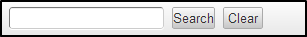
Specify clearfix class in the parent element and a class for float in child element.
<div class="imui-box-operation cf (1)">
  <div class="float-L (2)pl-10 (3)">
    <imart type="imuiTextbox"/>
    <imart type="imuiButton" value="Search"/>
    <imart type="imuiButton" value="clear"/>
  </div>
</div>
- Screen image
|
clearfix Class | Display the block element in each browser without breaking it |
|
Class for float | Set as float:left. Specify float-R class to place it to the right |
|
assist class | Set as padding-left:10px |
In HTML coding, when float: left is entered in the first child element, it is succeeded until it is cleared. However, in screen development, enter it in each child element. (With pl-10, the image cannot be captured correctly. div can capture 100%)
To display the character link in blue/black
Specifications
- The following is changed to blue (At the time of mouseover, light blue+underline).
Unspecified a tag class
- Following Table
- imui-table-box
- imui-table table
- imui-table-calendar
- imui-table-sort
- imui-table-mixed
- imui-table-inner
- imui-form
- imui-form-search-condition
- td of the following table
- imui-table-sort
Handling Methods
- Specify <a class=”imui-accent”> to change the black character link to blue.
- Specify <a class=”imui-unaccented”> to change the blue character link to black.
Refer to: Process icon/Process link
To place the title bar/tool bar in the UI component or CSS box item
To place the title bar/tool bar in the operation box
Handling Methods
Configuration
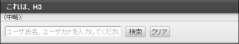
<div Tool box>
  <div Title Bar></div>
  <div Tool Bar></div>
  <div Contents></div>
</div>
Source
<div class="imui-box-toolbox (1) mt-20">
  <div class="imui-box-title (2) imui-box-toolbox-look (3)">
    <h3>This, H3</h3>
  </div>
  <div class="imui-toolbar-wrap">
    <div class="imui-box-toolbar-inner">
      <ul class="imui-list-box-toolbar">
        (Omitted)
      </ul>
    </div>
  </div>
  <div class="imui-box-toolbox-content">
    <!-- Simple Search -->
    <imart type="imuiTextbox" class="wd-225px" placeholder="Enter user name, user Kana." autofocus></imart>
    <imart type="imuiButton" value="Search" class="imui-button"></imart>
    <imart type="imuiButton" value="Clear" class="imui-button"></imart>
  </div>
</div>
- Screen Image
※Added Style
Tool box (Similar frame border as imui-box-operation)
imui-box-toolbox
Title bar (h2 and h3 have same appearance. While using imui-chapter-title.h2, use imui-box-title.h3)
imui-box-title, imui-box-title.h2, imui-box-title.h3
The upper part of title bar/tool bar have rounded corners (Fit in (1))
imui-box-toolbox-look
Contents
imui-box-toolbox-content
Tool bar
imui-toolbar-wrap, imui-box-toolbar-inner, imui-list-box-toolbar
To place tool bar in imuiDialog
Handling Methods
Use toolbarLeft attribute and toolbarRight attribute of imuiDialog. Confirm the API list imuiDialog for the details.
border of theme color
When specifying the theme color, border color, use the following CSS.
| Border color | imui-theme-border-color |
| specification |
Implementation Example
To draw a solid line of 100px in left-border
(1) CSS (width and style should be entered)
.new_class {
  border-left-width: 100px;
  border-left-style: solid;

  ...
}

Reference information
/* border of theme color */
.theme-border-color(@top-color: desaturate(@theme-color, 10%), @right-color:desaturate(@theme-color, 10%), @bottom-color: desaturate(@theme-color, 10%), @left-color:desaturate(@theme-color, 10%)) {
  border-top-color: @top-color;
  border-right-color: @right-color;
  border-bottom-color: @bottom-color;
  border-left-color: @left-color;
}
To provide the help text in the screen
- class of help text, icon.
- Help text is enclosed by imui-box-supplementation.
- Icon is displayed before the help text according to the text contents.
Icon Explanation im-ui-icon-common-24-information Information,item description/etc. im-ui-icon-common-24-confirmation Confirmation/Normal/Success/Success Message etc. im-ui-icon-common-24-question Confirmation Message etc. im-ui-icon-common-24-warning Warning Message etc. im-ui-icon-common-24-error Error Message etc.
Sample Code
<div class="imui-box-supplementation">
  <span class="im-ui-icon-common-24-confirmation float-L"></span>
  <p class="imui-pgh-section" style="padding-left: 30px;"><imart type="message" id="CAP.Z.IWP.SYSTEM.INITIALSETTINGS.MESSAGE"/></p>
</div>
- Screen Image
