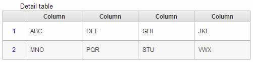
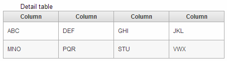
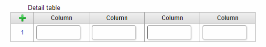
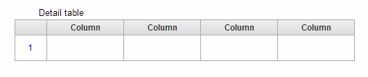
Detail table
Screen item “Detail table” is the item for adding lines when running the application and entering in table format.
Basic configuration
Label / [Front] Label / [Back] Label
It is used as supplementary for the name to be displayed on button or the name of input item.
When screen item is Input and Select item
The name set in label is displayed to the left of the input field.The name set in [Back] label is displayed to the right of the input field.When screen item is button
The name set in the label is displayed on the button.
Lines definition
Set the rows that can be added in the table.
Lines addable
If the check is ON, it is possible to add rows during the execution of the application.
Linage
Number of rows displayed in the table can be set when check of “Lines addable” is OFF.
Maximum linage
Maximum number of rows that can be added in the table can be set when check of “Lines addable” is ON.Set a value greater than 1 so that the number of rows entered can be added.
Column Definition
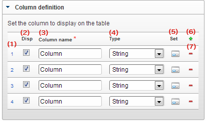 Set the column of Detail table.
Column number
Set the display sequence of column.When sorting the columns, they can be replaced by dragging.Disp
Set Display/Hide for the columns.When check is OFF, the columns are not displayed on the screen, however, it can be used for setting/acquiring the value.The check should be OFF (Hidden) when the type is “Hidden field”.Column name
Set the name of the column.Use as the logical name of the column in the application table corresponding to Detail table.Type
Set the data type of column.In case of a type that can refer to other screen items such as function or Select from list etc., it can be specified using the target Field ID similar to using “Function” or “Select from list”.Set
Transits to the “Column property” (Input field, input validation, etc) screen when it is clicked.Add
Add the Detail table column when it is clicked.Delete
Delete the Detail table column when it is clicked.Note
Regarding the display of Detail table
The operations for hide/display and display type of table, column of Detail table are as follows.Regarding display/hide column in “Column definition” of Detail table, if the display type of table is “Display”, then the value can be retained even though the column definition is set as “non-display”.If the display type of column is set for the display type, then the column display type settings gets priority over the table display type.When display type of table is set as non-display, it is not possible to set the display type of column.When non-display is set in the Table/column display type settings, the data is not saved.
Detail setting
Table ID
Use as physical name of application table corresponding to Detail table and grid table.Same table ID should be set for all tables when inheriting the values among tables in forms.
Label width
Specify the width to display the label value in pixels.
Item name
Specify the name to identify an item within the same form.When application type is “IM-Workflow” or in case of form created in IM-BIS, it is used in the name to be displayed at the time of ‘Append setting/job property setting’.
Column number display (At the time of reference)
When the display type for the table of Detail table is “Refer”, the display of column number at the left is set.When check is ON, the column number same as during the input is displayed.
When column number display is valid
When column number display is invalid
Screen type (Line item)
Add
Set the display type of registration screen in Web application (Standard).
Edit
Set the display type of update screen in Web application (Standard).
Refer
Set the display type of reference (details) screen in Web application (Standard).
Display/Input type (Column item)
Display/Enterable
Displays as an item that can be input.Display/Refer
Input is not possible, however, displays the settings value or entered value.Non-display
Input/Display is not possible.The settings value or entered value is not displayed. Moreover, reference from other items is also not possible.
Display type: Enterable
Display type: Refer
Item size/layout
Specify the height, width and display position of the item in the form.
Width
Specify the horizontal length (width) of the area (area surrounded by a red dotted line on designer screen) specified as an item, in pixels.
Height
Specify the vertical length (height) of the area (area surrounded by a red dotted line on designer screen) specified as an item, in pixels.
X
Specify the horizontal position from the top-left of the form of the top-left area (area surrounded by a red dotted line on designer screen) specified as an item, in pixels.
Y
Specify the vertical position from the top-left of the form of the top-left area (area surrounded by a red dotted line on designer screen) specified as an item, in pixels.
Display style
Label style /[Front] label style / [Back] label style
Specify the format of the label.
Font
Specify the types of fonts of the text.
Font size
Specify the font size in pixels.
Font color
Specify font color by selecting from color code (hexadecimals starting with #) or color picker.
Bold
Set whether the text is to be displayed in bold.Display the text in bold when check is ON.
Italic
Set whether the text is to be displayed in italic.Display the text in italic when check is ON.
Underline
Set whether underline is to be displayed for the text.Display underline for the text when check is ON.
Background color
Specify the background color by selecting from color code (hexadecimals starting with #) or color picker.
Column properties (Character string)
Setting screen for moving by clicking the column settings.Set the following items when the type of column is set to “Character string”.
Input Validation
Set the input check to be used in item.
Required / [Start] Required / [End] Required
It is checked as compulsory input item when the check is ON.
Only alphanumeric
Checks whether the input contents are only single byte alphanumeric characters if the check is ON.Only a-z, A-Z, 0-9 characters can be entered and symbols are considered as an error.
Minimum letters
Checks whether the entered characters are more than the number of characters specified in item.It is not checked if there is no input in the item.Space is treated as an input item.Set a value less than or equal to the maximum letters.
Maximum letters
Set it such that characters are entered only upto the number of characters specified in the item.Space is treated as an input item.Set a value more than or equal to the minimum letters.
Custom input check
It is possible to customize and set the type of input characters and input check function.
Check format
Set the pattern of string that can be entered in regular expression.If a string that does not match with the set pattern is entered, the message set in “Error message” is displayed.
Error message
Registers the error message to be displayed when the pattern set in check format is not matched.
Field ID/ [Start] Field ID / [End] Field ID
It is used as the physical name (column name) of item in the application table.Set in such a way that field ID of all the items should be unique within the same application.
Field ID name / [Start] Field ID name / [End] Field ID name
It is used as the logical name of an item in application table.In addition, it is also used as the item name (Logical name) corresponding to the items in the list display screen.
Add to DB
Sets whether to register the value entered in the item in the database.If check is OFF, it is not registered in database.When workflow function is used, set the check to OFF since the correct value may not be displayed.
Initial value / Default selected option / [Start] Initial value / [End] Initial value
Set the value to be displayed initially in the input field.Set whether to display “Current date” as the initial value in case of items dealing with date.In case of selection type items such as select box etc., sets the value (Transmission value) to be selected in initial display.In case of “Select user”, sets whether to display “User name of Login user” in initial value.
Field width
Specify the width of input field display in pixels.
Border
Set the frame border.
- frames: Frame border is displayed.
- No frames: Frame border is not displayed.
- Only bottom: Underline is displayed.
Border color
Specify the frame border color by selecting from color code (hexadecimals starting with #) or color picker.
Border shadow
Set whether to apply shadow to the frame border.Shadow is applied to the frame border when check is ON.
Display type (column)
When “Set display type by column unit” check is ON, display type is set for the column.When display type of column is set, it gets the priority over the display type of table.When the table display type is set to “Enterable” or “Non-display”, column display type cannot be set.
Screen type (Line item)
Add
Set the display type of registration screen in Web application (Standard).
Edit
Set the display type of update screen in Web application (Standard).
Refer
Set the display type of reference (details) screen in Web application (Standard).
Display/Input type (Column item)
Display/Enterable
Displays as an item that can be input.Display/Refer
Input is not possible, however, displays the settings value or entered value.Non-display
Input/Display is not possible.The settings value or entered value is not displayed. Moreover, reference from other items is also not possible.
Column properties (Number)
Setting screen for moving by clicking the column settings.Set the following items when the type of column is set to “Number”.
Display format (3 digits comma)
Displays the entered numerical value separated with a comma after every 3 digits if the check is ON.
Input Validation
Set the input check to be used in item.
Required / [Start] Required / [End] Required
It is checked as compulsory input item when the check is ON.
Minimum value
Checks whether the entered/calculated value is greater than the specified value.It is not checked if the value is not entered in the item.If “Minus allowed” check is ON, a negative number (value less than 0) can be set.Set a value less than or equal to the maximum input value.
Maximum value
Checks whether the entered/calculated value is smaller than the specified value.If “Minus allowed” check is ON, a negative number (value less than 0) can be set.Set a value more than or equal to the minimum input value.
Minus allowed (numerical value)
Sets whether a minus value (less than 0) can be input for the value to be entered or calculated.It is handled as an error when a minus value (less than 0) is entered if the check is OFF.
Decimal allowed (Numerical value)
Sets whether a decimal value can be set in the entered/calculated value.It is handled as an error if a decimal value is entered when the check is OFF.
Max decimal places (numerical value)
Set the number of digits after decimal point for the entered/calculated value.(This settings item is displayed only when “Decimal allowed ” check is ON)The number of digits should be set so as to match with the number of digits after decimal point of the line corresponding to table setting.
Field ID/ [Start] Field ID / [End] Field ID
It is used as the physical name (column name) of item in the application table.Set in such a way that field ID of all the items should be unique within the same application.
Field ID name / [Start] Field ID name / [End] Field ID name
It is used as the logical name of an item in application table.In addition, it is also used as the item name (Logical name) corresponding to the items in the list display screen.
Add to DB
Sets whether to register the value entered in the item in the database.If check is OFF, it is not registered in database.When workflow function is used, set the check to OFF since the correct value may not be displayed.
Initial value / Default selected option / [Start] Initial value / [End] Initial value
Set the value to be displayed initially in the input field.Set whether to display “Current date” as the initial value in case of items dealing with date.In case of selection type items such as select box etc., sets the value (Transmission value) to be selected in initial display.In case of “Select user”, sets whether to display “User name of Login user” in initial value.
Field width
Specify the width of input field display in pixels.
Border
Set the frame border.
- frames: Frame border is displayed.
- No frames: Frame border is not displayed.
- Only bottom: Underline is displayed.
Border color
Specify the frame border color by selecting from color code (hexadecimals starting with #) or color picker.
Border shadow
Set whether to apply shadow to the frame border.Shadow is applied to the frame border when check is ON.
Display type (column)
When “Set display type by column unit” check is ON, display type is set for the column.When display type of column is set, it gets the priority over the display type of table.When the table display type is set to “Enterable” or “Non-display”, column display type cannot be set.
Screen type (Line item)
Add
Set the display type of registration screen in Web application (Standard).
Edit
Set the display type of update screen in Web application (Standard).
Refer
Set the display type of reference (details) screen in Web application (Standard).
Display/Input type (Column item)
Display/Enterable
Displays as an item that can be input.Display/Refer
Input is not possible, however, displays the settings value or entered value.Non-display
Input/Display is not possible.The settings value or entered value is not displayed. Moreover, reference from other items is also not possible.
Column properties (Date)
Setting screen for moving by clicking the column settings.Set the following items when the type of column is set to “Date”.
Display format (Date)
Select the display format of date of input field at the time of view.If it is not specified, date is displayed in “Date (Standard display)” format set in “Display format of Date and Time”.
Field enterable
The value entered manually can be registered if the check is ON.
Input clear button
Clear button is set if the check is ON.The input value is cleared if clear button is clicked while executing the application.
Input Validation
Set the input check to be used in item.
Required / [Start] Required / [End] Required
It is checked as compulsory input item when the check is ON.
Field ID/ [Start] Field ID / [End] Field ID
It is used as the physical name (column name) of item in the application table.Set in such a way that field ID of all the items should be unique within the same application.
Field ID name / [Start] Field ID name / [End] Field ID name
It is used as the logical name of an item in application table.In addition, it is also used as the item name (Logical name) corresponding to the items in the list display screen.
Add to DB
Sets whether to register the value entered in the item in the database.If check is OFF, it is not registered in database.When workflow function is used, set the check to OFF since the correct value may not be displayed.
Initial value / Default selected option / [Start] Initial value / [End] Initial value
Set the value to be displayed initially in the input field.Set whether to display “Current date” as the initial value in case of items dealing with date.In case of selection type items such as select box etc., sets the value (Transmission value) to be selected in initial display.In case of “Select user”, sets whether to display “User name of Login user” in initial value.
Field width
Specify the width of input field display in pixels.
Border
Set the frame border.
- frames: Frame border is displayed.
- No frames: Frame border is not displayed.
- Only bottom: Underline is displayed.
Border color
Specify the frame border color by selecting from color code (hexadecimals starting with #) or color picker.
Border shadow
Set whether to apply shadow to the frame border.Shadow is applied to the frame border when check is ON.
Display type (column)
When “Set display type by column unit” check is ON, display type is set for the column.When display type of column is set, it gets the priority over the display type of table.When the table display type is set to “Enterable” or “Non-display”, column display type cannot be set.
Screen type (Line item)
Add
Set the display type of registration screen in Web application (Standard).
Edit
Set the display type of update screen in Web application (Standard).
Refer
Set the display type of reference (details) screen in Web application (Standard).
Display/Input type (Column item)
Display/Enterable
Displays as an item that can be input.Display/Refer
Input is not possible, however, displays the settings value or entered value.Non-display
Input/Display is not possible.The settings value or entered value is not displayed. Moreover, reference from other items is also not possible.
Column properties (Function)
Setting screen for moving by clicking the column settings.Set the following items when the type of column is set to “Function”.
Expression
Set the calculation or function to process by referring the value specified previously or the value of other items in the form.In case of referring the value of other items, specify with “Field ID” of the item to be referred.Enclose with double quotation mark (”) in case of specifying fixed characters.
Available operators, functions
Data type / Data type of evaluation result of expression
Specify the data type of the value to be stored in an item, or the value of evaluation result of function and the value to be stored in Hidden field.The value is not stored correctly if correct data type is not selected depending on the function that is used.
String
- The target data is handled as character data such as alphabetical characters, numeric values, kanji/hiragana etc.
Numeric value
- The target data is handled as numerical data such as decimal or integer, negative value etc.
Date
- The target value is handled as date data.
- Time or information of time zone is not stored.
Timestamp
- The target value is handled as the date data which stores time and time zone information.
Display format (3 digits comma)
Displays the entered numerical value separated with a comma after every 3 digits if the check is ON.
Display format (Date)
Select the display format of date of input field at the time of view.If it is not specified, date is displayed in “Date (Standard display)” format set in “Display format of Date and Time”.
Input Validation
Set the input check to be used in item.
Required / [Start] Required / [End] Required
It is checked as compulsory input item when the check is ON.
Only alphanumeric
Checks whether the input contents are only single byte alphanumeric characters if the check is ON.Only a-z, A-Z, 0-9 characters can be entered and symbols are considered as an error.
Minimum letters
Checks whether the entered characters are more than the number of characters specified in item.It is not checked if there is no input in the item.Space is treated as an input item.Set a value less than or equal to the maximum letters.
Maximum letters
Set it such that characters are entered only upto the number of characters specified in the item.Space is treated as an input item.Set a value more than or equal to the minimum letters.
Custom input check
It is possible to customize and set the type of input characters and input check function.
Check format
Set the pattern of string that can be entered in regular expression.If a string that does not match with the set pattern is entered, the message set in “Error message” is displayed.
Error message
Registers the error message to be displayed when the pattern set in check format is not matched.
Minimum value
Checks whether the entered/calculated value is greater than the specified value.It is not checked if the value is not entered in the item.If “Minus allowed” check is ON, a negative number (value less than 0) can be set.Set a value less than or equal to the maximum input value.
Maximum value
Checks whether the entered/calculated value is smaller than the specified value.If “Minus allowed” check is ON, a negative number (value less than 0) can be set.Set a value more than or equal to the minimum input value.
Minus allowed (numerical value)
Sets whether a minus value (less than 0) can be input for the value to be entered or calculated.It is handled as an error when a minus value (less than 0) is entered if the check is OFF.
Decimal allowed (Numerical value)
Sets whether a decimal value can be set in the entered/calculated value.It is handled as an error if a decimal value is entered when the check is OFF.
Max decimal places (numerical value)
Set the number of digits after decimal point for the entered/calculated value.(This settings item is displayed only when “Decimal allowed ” check is ON)The number of digits should be set so as to match with the number of digits after decimal point of the line corresponding to table setting.
Field ID/ [Start] Field ID / [End] Field ID
It is used as the physical name (column name) of item in the application table.Set in such a way that field ID of all the items should be unique within the same application.
Field ID name / [Start] Field ID name / [End] Field ID name
It is used as the logical name of an item in application table.In addition, it is also used as the item name (Logical name) corresponding to the items in the list display screen.
Add to DB
Sets whether to register the value entered in the item in the database.If check is OFF, it is not registered in database.When workflow function is used, set the check to OFF since the correct value may not be displayed.
Field width
Specify the width of input field display in pixels.
Border
Set the frame border.
- frames: Frame border is displayed.
- No frames: Frame border is not displayed.
- Only bottom: Underline is displayed.
Border color
Specify the frame border color by selecting from color code (hexadecimals starting with #) or color picker.
Border shadow
Set whether to apply shadow to the frame border.Shadow is applied to the frame border when check is ON.
Display type (column)
When “Set display type by column unit” check is ON, display type is set for the column.When display type of column is set, it gets the priority over the display type of table.When the table display type is set to “Enterable” or “Non-display”, column display type cannot be set.
Screen type (Line item)
Add
Set the display type of registration screen in Web application (Standard).
Edit
Set the display type of update screen in Web application (Standard).
Refer
Set the display type of reference (details) screen in Web application (Standard).
Display/Input type (Column item)
Display/Enterable
Displays as an item that can be input.Display/Refer
Input is not possible, however, displays the settings value or entered value.Non-display
Input/Display is not possible.The settings value or entered value is not displayed. Moreover, reference from other items is also not possible.
Column properties (Select from list)
Setting screen for moving by clicking the column settings.When the type of column is set to “Select from list”, perform settings related to external linkage from the External linkage settings link,and settings related to Display/input field from the Input field settings link.
Item select screen
Set the layout of item list that can be selected when Search icon is clicked.
Screen title
Enter the title of the screen displayed as separate screen.Max display rows
Set maximum lines that can be displayed on list screen.Multiselect
Multiple lines can be selected on list screen when check is ON.Note that only the first item is reflected in select from list item field even when multiple lines are selected.Display
Set whether to display or not in the list screen.Display on list screen when check is ON.Column name
Set the column name to be displayed on list screen.Column ID
ID for identifying the columns displayed on list screen uniformly.Displayed in the format of “{Column name} | {Column ID}” in data mapper.Type
Set the data type of column.
Obtained value setting
Perform mapping of the destination where the value obtained in external linkage should be reflected.
Mapping information
After the data mapper is displayed by clicking on Magnifying glass icon, set the mapping for items to be mapped in data mapper.Note
For methods of setting links for using data source, refer to “IM-BIS for Accel Platform Business manager guide”.
Data type / Data type of evaluation result of expression
Specify the data type of the value to be stored in an item, or the value of evaluation result of function and the value to be stored in Hidden field.The value is not stored correctly if correct data type is not selected depending on the function that is used.
String
- The target data is handled as character data such as alphabetical characters, numeric values, kanji/hiragana etc.
Numeric value
- The target data is handled as numerical data such as decimal or integer, negative value etc.
Date
- The target value is handled as date data.
- Time or information of time zone is not stored.
Timestamp
- The target value is handled as the date data which stores time and time zone information.
Field enterable
The value entered manually can be registered if the check is ON.
Input clear button
Clear button is set if the check is ON.The input value is cleared if clear button is clicked while executing the application.
Input Validation
Set the input check to be used in item.
Required / [Start] Required / [End] Required
It is checked as compulsory input item when the check is ON.
Only alphanumeric
Checks whether the input contents are only single byte alphanumeric characters if the check is ON.Only a-z, A-Z, 0-9 characters can be entered and symbols are considered as an error.
Minimum letters
Checks whether the entered characters are more than the number of characters specified in item.It is not checked if there is no input in the item.Space is treated as an input item.Set a value less than or equal to the maximum letters.
Maximum letters
Set it such that characters are entered only upto the number of characters specified in the item.Space is treated as an input item.Set a value more than or equal to the minimum letters.
Custom input check
It is possible to customize and set the type of input characters and input check function.
Check format
Set the pattern of string that can be entered in regular expression.If a string that does not match with the set pattern is entered, the message set in “Error message” is displayed.
Error message
Registers the error message to be displayed when the pattern set in check format is not matched.
Field ID/ [Start] Field ID / [End] Field ID
It is used as the physical name (column name) of item in the application table.Set in such a way that field ID of all the items should be unique within the same application.
Field ID name / [Start] Field ID name / [End] Field ID name
It is used as the logical name of an item in application table.In addition, it is also used as the item name (Logical name) corresponding to the items in the list display screen.
Add to DB
Sets whether to register the value entered in the item in the database.If check is OFF, it is not registered in database.When workflow function is used, set the check to OFF since the correct value may not be displayed.
Initial value / Default selected option / [Start] Initial value / [End] Initial value
Set the value to be displayed initially in the input field.Set whether to display “Current date” as the initial value in case of items dealing with date.In case of selection type items such as select box etc., sets the value (Transmission value) to be selected in initial display.In case of “Select user”, sets whether to display “User name of Login user” in initial value.
Field width
Specify the width of input field display in pixels.
Border
Set the frame border.
- frames: Frame border is displayed.
- No frames: Frame border is not displayed.
- Only bottom: Underline is displayed.
Border color
Specify the frame border color by selecting from color code (hexadecimals starting with #) or color picker.
Border shadow
Set whether to apply shadow to the frame border.Shadow is applied to the frame border when check is ON.
Display type (column)
When “Set display type by column unit” check is ON, display type is set for the column.When display type of column is set, it gets the priority over the display type of table.When the table display type is set to “Enterable” or “Non-display”, column display type cannot be set.
Screen type (Line item)
Add
Set the display type of registration screen in Web application (Standard).
Edit
Set the display type of update screen in Web application (Standard).
Refer
Set the display type of reference (details) screen in Web application (Standard).
Display/Input type (Column item)
Display/Enterable
Displays as an item that can be input.Display/Refer
Input is not possible, however, displays the settings value or entered value.Non-display
Input/Display is not possible.The settings value or entered value is not displayed. Moreover, reference from other items is also not possible.
Column properties (Radio button)
Setting screen for moving by clicking the column settings.When the type of column is set to “Radio button”, perform settings related to select data from Select data link,and settings related to Display/input field from Input field settings link.
Definition of items
Set the value that can be selected in items.The values that can be selected can be added or deleted using the + and - signs on right side of the column.
Display value
Set the value to be displayed on the screen.Sent value
Set the value registered in database as the value selected in item.When multiple items can be selected, save in database by delimiting with comma. Comma ”,” cannot be used in item value.
Setting item when acquisition source of value is “Data source set value”
Datasource name
Select the query to be used from the query list defined in datasource definition.The setting item of parameter etc., is initialized when the query is selected.
Parameter setting
Set the search conditions for the selected query.The value of search condition can also set the function other than the fixed value.
- Condition item
Enter the value to be set in condition item (input value) that is set in datasource definition.
The available operators and functions are as follows.
Obtained value setting
Sets how to handle the data acquired by the selected query in an item.
Display value
Sets the value to be displayed on screen.Send value
Set the value registered in database as the value selected in item.When multiple items are selected, save in the database using comma separator. Therefore, comma ”,” cannot be used in item value.
Input Validation
Set the input check to be used in item.
Required / [Start] Required / [End] Required
It is checked as compulsory input item when the check is ON.
Field ID/ [Start] Field ID / [End] Field ID
It is used as the physical name (column name) of item in the application table.Set in such a way that field ID of all the items should be unique within the same application.
Field ID name / [Start] Field ID name / [End] Field ID name
It is used as the logical name of an item in application table.In addition, it is also used as the item name (Logical name) corresponding to the items in the list display screen.
Add to DB
Sets whether to register the value entered in the item in the database.If check is OFF, it is not registered in database.When workflow function is used, set the check to OFF since the correct value may not be displayed.
Initial value / Default selected option / [Start] Initial value / [End] Initial value
Set the value to be displayed initially in the input field.Set whether to display “Current date” as the initial value in case of items dealing with date.In case of selection type items such as select box etc., sets the value (Transmission value) to be selected in initial display.In case of “Select user”, sets whether to display “User name of Login user” in initial value.
Orientation
Set the direction to align the item.If “Horizontal” is selected, the set item is aligned horizontally according to the width of the item size. (The part exceeding the width is continued on the next line.)If “Vertical” is selected, the set item is aligned vertically according to the width of the item size.
Display type (column)
When “Set display type by column unit” check is ON, display type is set for the column.When display type of column is set, it gets the priority over the display type of table.When the table display type is set to “Enterable” or “Non-display”, column display type cannot be set.
Screen type (Line item)
Add
Set the display type of registration screen in Web application (Standard).
Edit
Set the display type of update screen in Web application (Standard).
Refer
Set the display type of reference (details) screen in Web application (Standard).
Display/Input type (Column item)
Display/Enterable
Displays as an item that can be input.Display/Refer
Input is not possible, however, displays the settings value or entered value.Non-display
Input/Display is not possible.The settings value or entered value is not displayed. Moreover, reference from other items is also not possible.
Column properties (Select box)
Setting screen for moving by clicking the column settings.When the type of column is set to “Select box”, perform settings related to select data from Select data link,and settings related to Display/input field from Input field settings link.
Definition of items
Set the value that can be selected in items.The values that can be selected can be added or deleted using the + and - signs on right side of the column.
Display value
Set the value to be displayed on the screen.Sent value
Set the value registered in database as the value selected in item.When multiple items can be selected, save in database by delimiting with comma. Comma ”,” cannot be used in item value.
Setting item when acquisition source of value is “Data source set value”
Datasource name
Select the query to be used from the query list defined in datasource definition.The setting item of parameter etc., is initialized when the query is selected.
Parameter setting
Set the search conditions for the selected query.The value of search condition can also set the function other than the fixed value.
- Condition item
Enter the value to be set in condition item (input value) that is set in datasource definition.
The available operators and functions are as follows.
Obtained value setting
Sets how to handle the data acquired by the selected query in an item.
Display value
Sets the value to be displayed on screen.Send value
Set the value registered in database as the value selected in item.When multiple items are selected, save in the database using comma separator. Therefore, comma ”,” cannot be used in item value.
Empty at the top
When check is ON, a blank line is displayed in the first item of the input field.
Input Validation
Set the input check to be used in item.
Required / [Start] Required / [End] Required
It is checked as compulsory input item when the check is ON.
Field ID/ [Start] Field ID / [End] Field ID
It is used as the physical name (column name) of item in the application table.Set in such a way that field ID of all the items should be unique within the same application.
Field ID name / [Start] Field ID name / [End] Field ID name
It is used as the logical name of an item in application table.In addition, it is also used as the item name (Logical name) corresponding to the items in the list display screen.
Add to DB
Sets whether to register the value entered in the item in the database.If check is OFF, it is not registered in database.When workflow function is used, set the check to OFF since the correct value may not be displayed.
Initial value / Default selected option / [Start] Initial value / [End] Initial value
Set the value to be displayed initially in the input field.Set whether to display “Current date” as the initial value in case of items dealing with date.In case of selection type items such as select box etc., sets the value (Transmission value) to be selected in initial display.In case of “Select user”, sets whether to display “User name of Login user” in initial value.
Field width
Specify the width of input field display in pixels.
Display type (column)
When “Set display type by column unit” check is ON, display type is set for the column.When display type of column is set, it gets the priority over the display type of table.When the table display type is set to “Enterable” or “Non-display”, column display type cannot be set.
Screen type (Line item)
Add
Set the display type of registration screen in Web application (Standard).
Edit
Set the display type of update screen in Web application (Standard).
Refer
Set the display type of reference (details) screen in Web application (Standard).
Display/Input type (Column item)
Display/Enterable
Displays as an item that can be input.Display/Refer
Input is not possible, however, displays the settings value or entered value.Non-display
Input/Display is not possible.The settings value or entered value is not displayed. Moreover, reference from other items is also not possible.